A header graphic and Logo for a Mime
So this was a different client than usual; Its not everyday you get to work with an abstract Mime!
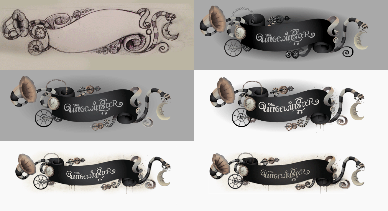
The Header graphic comes to life
Malik, who is inside the
Ungewinster, got in touch and asked me to create him a nice header for his new website.

The Mime The Ungewinster
The Ungewinster is, in his own words;
“a shadow spook made from a handful of dust, bits of clockwork and a dollop of darkness”
I love his dark visual athmosphere reminiscent of Tim Burton, with some steampunk elements and a solid dose of both horror and humour added to it. So I couldn’t resist this project!
First off, he needed a logo, so I drew him up a curly hand drawn logo type incorporating his glowing goggles and top hat from one of his acts. He mainly wanted to use the logo with the graphic I was going to make him, but we made sure the logotype would work on its own as well.
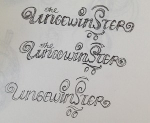
Sketches for the logo type
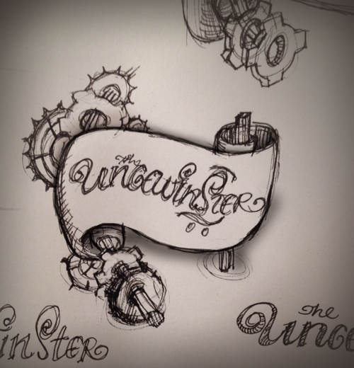
One of the initial sketches for the header
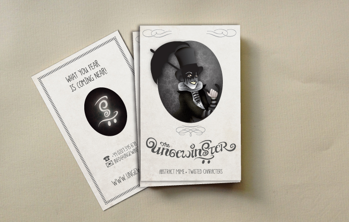
Mock ups of Calling cards using the logo type
When we had the logo type down we started working on his graphic. Malik had several objects and themes he wanted to incorporate in the graphic, elements of his characters and things that would hint to his artistic language. I wanted it to have a worn, scruffy, sepia quality and decided to use a lot of textures to achieve this.
There were a lot of adjustments and ping pong with Malik to get the graphic just right; fitting in with his site, telling the right visual story, and getting the right look and feel to it- See the time-lapse at the top.
At the end we had a nice graphic that we are both happy with.

The final Graphic


Leave a Reply